Over four years, I helped transform Cross Screen Media from an outdated planning tool into the most advanced political advertising analytics platform in the industry—unifying audience discovery, media planning, and measurement reporting into one cohesive experience.
"Political agencies need to understand their audiences at a granular level, but most tools either drown them in raw data or oversimplify the insights."
We needed to make complex data feel intuitive.
When I joined Cross Screen Media as Lead Product Designer in 2021, the platform was showing its age. The existing web application was functional but clunky—built years earlier without a cohesive design system, and scattered across multiple disconnected tools. The company was ready to evolve its business model, consolidating several services into a single unified platform.
What made this role unique was the culture. Cross Screen Media is a hands-on company that actively encourages reaching across departments to solve problems. I wasn't siloed in a design corner—I was in the room with data scientists figuring out how to visualize complex voter models, pairing with engineers on component architecture, sitting in on sales calls to hear client pain points firsthand. That access shaped everything I built.
This wasn't a single project—it was four years of continuous improvement, major feature launches, and deep cross-team collaboration. As Lead Product Designer, I had a seat at the table with product, engineering, data science, marketing, and sales. Here's what I owned:
Led the complete redesign of the audience discovery experience—creating an intuitive drag-and-drop system for building complex voter segments with real-time audience sizing.
Developed a comprehensive library of charts, tables, and interactive graphics in close collaboration with the data science team—finding creative ways to represent complex political data.
Rebuilt the entire Figma design system from scratch, creating reusable components that accelerated both design and development velocity across the team.
Designed the reporting interface for cross-platform campaign measurement, helping clients understand performance across TV, digital, and streaming.
Created specialized visualizations for television-specific analytics, including viewership patterns, ad detection, and competitive spending analysis.
Worked directly with the VP of Marketing to unify visual language across the product platform, website, and social media—contributing to a cohesive brand refresh.
The Audience Builder is the heart of the platform—where political agencies define exactly who they want to reach. I redesigned this from a confusing multi-step wizard into an intuitive real-time builder.
Turning raw political data into actionable insights. I partnered closely with the data science team—sometimes daily—to find the clearest ways to represent relationships that had never been visualized before.
Multi-dimensional data tables with heat-mapped cells for instant pattern recognition. Users can compare audience segments across geography, demographics, and media markets simultaneously.
Every table is fully interactive—click to drill down, sort by any column, and export filtered views. The data updates in real-time as users adjust their audience definitions.
Color-coded density indicators help users spot concentrations at a glance. The visual weight of each cell communicates relative importance without requiring manual comparison.
When I joined, the Figma files were a mess—inconsistent components, no documentation, and designs that didn't match what was in production. I rebuilt everything from scratch: a complete component library with variants, proper auto-layout, and detailed specifications for the engineering team.
The result was dramatic. What used to take days to design could now be assembled in hours. More importantly, it brought alignment between design and development—we were finally speaking the same language with the same building blocks.
My role extended well beyond feature design. I became a bridge between teams, helping translate complex requirements into actionable solutions.
Conducted customer interviews, usability tests, and feedback sessions. These insights directly shaped feature priorities and caught usability issues before they reached production.
Created an internal communication format for product updates—now adopted company-wide, including by the CEO. Clear, visual summaries that keep everyone aligned on what's shipping and why.
Worked directly with the VP of Marketing to create case study formats, social media templates, and video content. Supervised motion graphics and ensured visual consistency across all channels.
Built strong relationships with the front-end team, creating documentation and prototypes that accelerated development. We iterated together, not in silos.
Contributed to a new brand guide that aligned the product platform with external marketing—unified colors, typography, and visual language across every touchpoint.
Introduced modern prototyping practices to the team—interactive Figma flows that let stakeholders experience features before a line of code was written.
Four years is a long time. Long enough to see features I designed in 2021 become core workflows that users depend on daily. Long enough to watch the company triple its revenue and reach its most successful point since inception. I'm proud of what we built together.
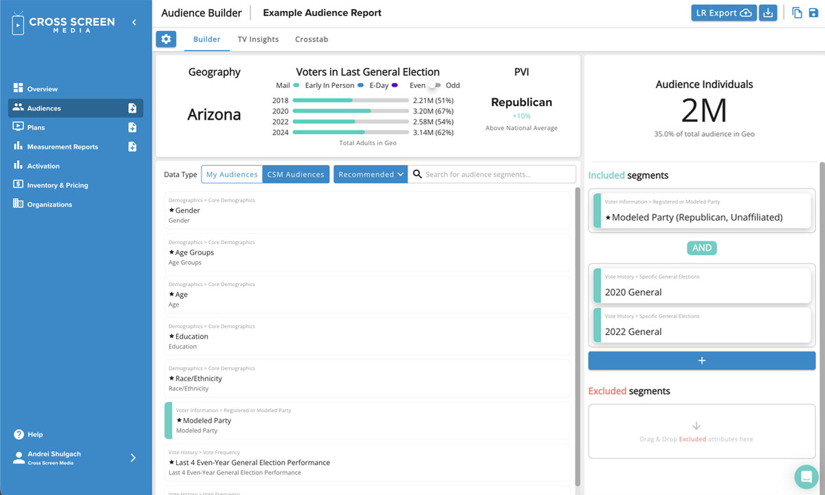
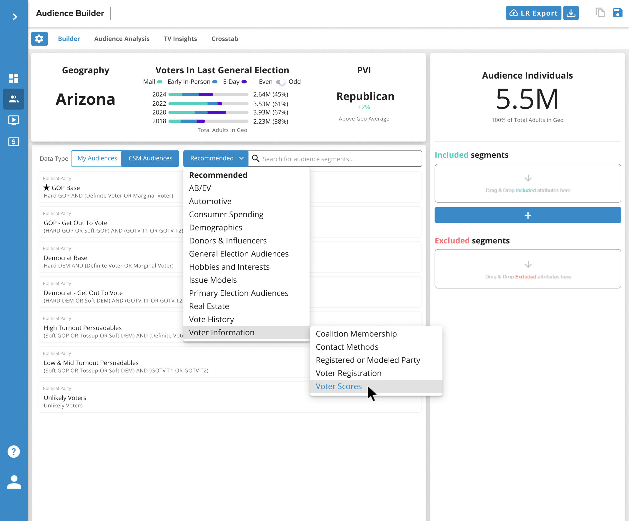
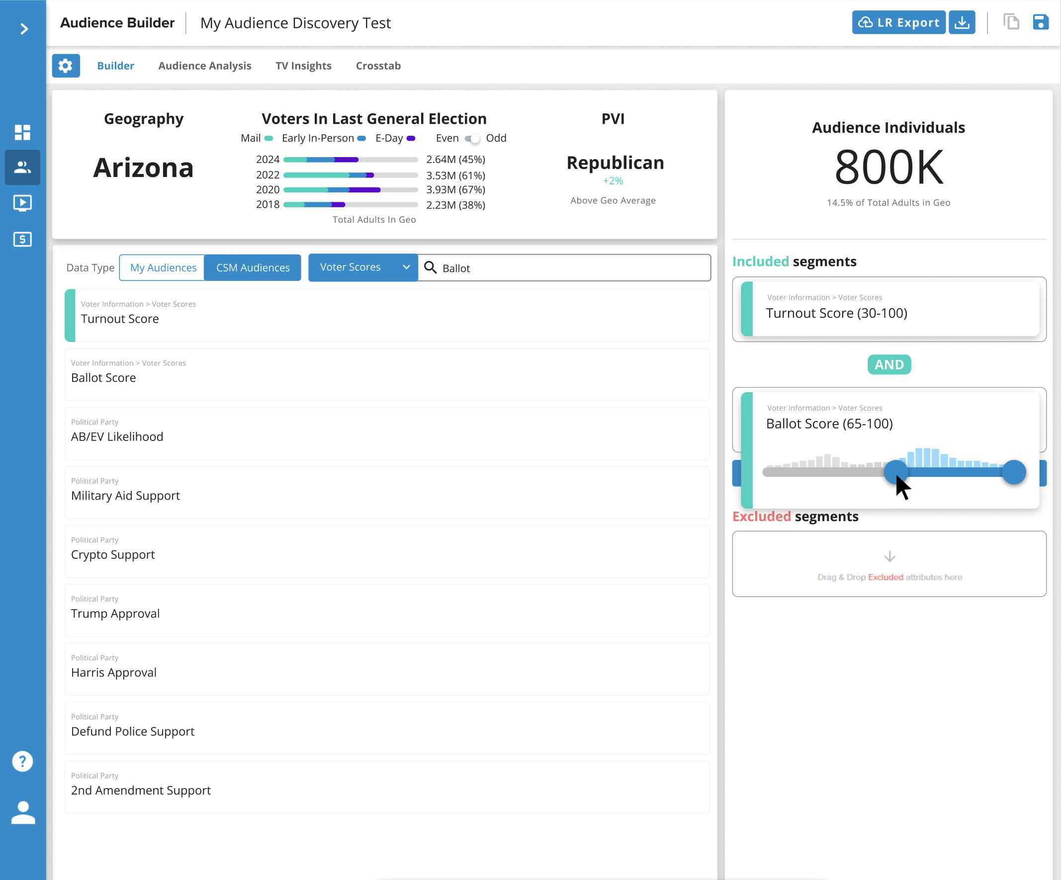
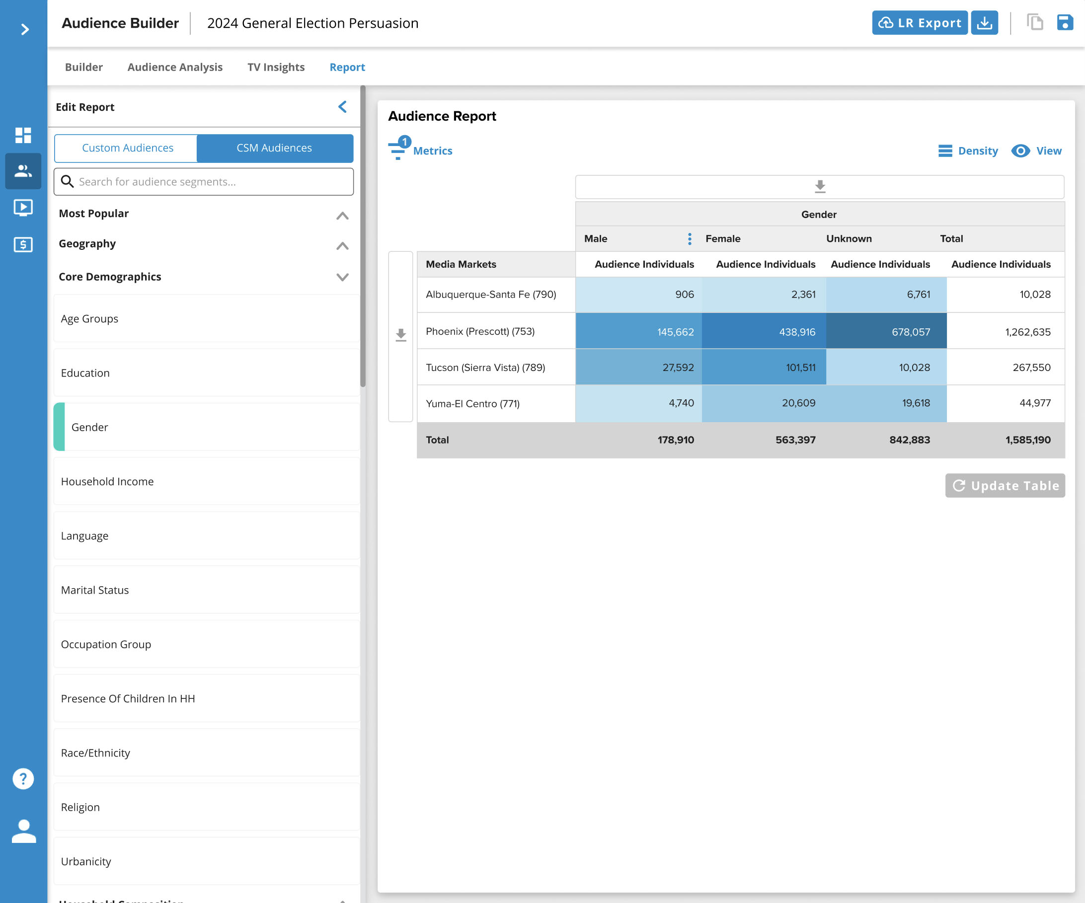
The biggest lesson? Complex data doesn't have to feel complex. Every chart, every table, every interaction is an opportunity to make something intimidating feel approachable. Political advertising is a high-stakes world with serious money on the line—the people using these tools don't have time to figure out confusing interfaces. They need clarity, speed, and confidence that they're making the right decisions.
This role also taught me the value of being embedded across teams. The best insights came from unexpected places—a comment from a sales rep about how clients actually use the tool, a constraint from engineering that led to a better solution, a question from data science that revealed a gap in my understanding. Cross Screen Media's culture of open collaboration made me a significantly better designer.
Great product design isn't just about the pixels—it's about the relationships. The features that shipped successfully were the ones where design, engineering, data science, and stakeholders were genuinely aligned. My job wasn't just to make things look good; it was to make everyone's job easier.